
A powerful newsroom to drive superior editorial
Project: Comprehensive media platform redesign
Role: System design, information architecture, editorial experience design
@MIT Technology Review

I led the comprehensive redesign of MIT Technology Review’s digital platform, synthesizing concepts from Upstatement and Pentagram into a cohesive system. The redesign increased reader engagement through social media-inspired infinite scroll functionality while maintaining the historic publication’s journalistic integrity during a complete technology rebuild.
Brief
MIT Technology Review is an independent media company founded in 1899, dedicated to explaining how emerging technologies impact our lives. With over a million monthly readers, they needed to modernize their digital presence while maintaining their authoritative voice in technology journalism.
This effort culminated in a full-scale redesign, replatforming, and complete rebuild of the company’s technology stack. It was a lot of change all at once, and our newsroom needed to continue to write and publish throughout.
My challenge consisted of three primary areas of concern:
Integrate Upstatement's product concept and Pentagram's brand redesign with an evolving publishing format and extensive archive
Optimize and extend the newsroom’s existing workflow with a custom CMS that serves multiple timelines, technical requirements, and user profiles
Facilitate alignment and critical decision making between internal stakeholders in business, editorial, marketing, product, and design

Approach
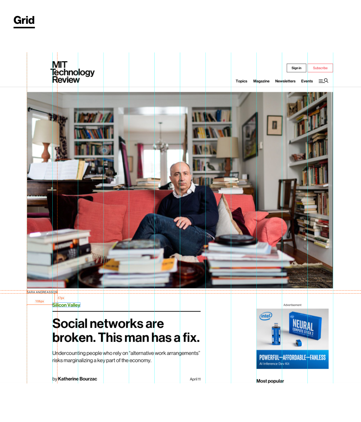
I started by refining and reducing the number of styles and component variations in our design system, applying accessibility standards and extending that system throughout the site. I established a responsive 12-column grid that met the demands of our highly-trafficked story pages as well as our redesign’s central concept — an infinite-scroll, social media-style feed of story teases in various formats, which lived on our homepage and at the bottom of every story.
As lead designer and product manager, I participated in daily standups with engineering team, held frequent syncs with newsroom editors, and led presentations for senior leadership to report on project status and maintain stakeholder alignment.
Phase 1: Foundation
Audited existing site: 1,200+ pages, 47 templates, 156 component variations
Assembled design system and 12-column responsive grid that supported both traditional article layouts and dynamic feed components
Established WCAG-compliant accessibility standards
Phase 2: Information Architecture
Simplified navigation from 6 levels to 3
Consolidated 23 section pages into 8 clear categories
Created unified taxonomy system
Phase 3: Feature Development
Built chronological story feed with smart ad placement
Integrated sponsored content without disrupting reading flow
Developed CMS tools for editorial control
Results
Through leadership changes and an evolving business strategy, I took a systematic approach to advocating for our readers and solving problems for our editors.
Our successes included:
“The Midnight Shuffle”: An algorithmic content randomization system that refreshed the homepage layout daily, creating a fresh experience for returning visitors while maintaining editorial control
Rhino 2.0: significant redesign and integration of our inhouse CMS, based on extensive user feedback from our newsroom
Ready for what’s next: Balanced traditional long-form and multi-medium journalism with modern engagement patterns, including increased support for publishing velocity and new revenue models