
Independent journalism that holds tech accountable
Project: Comprehensive media platform redesign
Role: System design, information architecture, editorial experience design
Implemented established product concept by building a comprehensive design system and designing screens sitewide; managed documentation for engineering handoff; designed and iterated on new features
@MIT Technology Review
Product concept: Upstatement
Art direction: Pentagram
Between 2018 and 2020, MIT Technology Review underwent a full-scale redesign, replatforming, and complete rebuild of its technology stack. It was a lot of change all at once, and our newsroom needed to continue to write and publish throughout. Based on a site concept and strategy by Upstatement and a simultaneous publication and brand redesign by Pentagram, I was responsible for synthesizing and implementing a cohesive design sitewide.
Through leadership changes and an evolving business strategy, I took a systematic approach to advocating for our readers and solving problems for our editors.
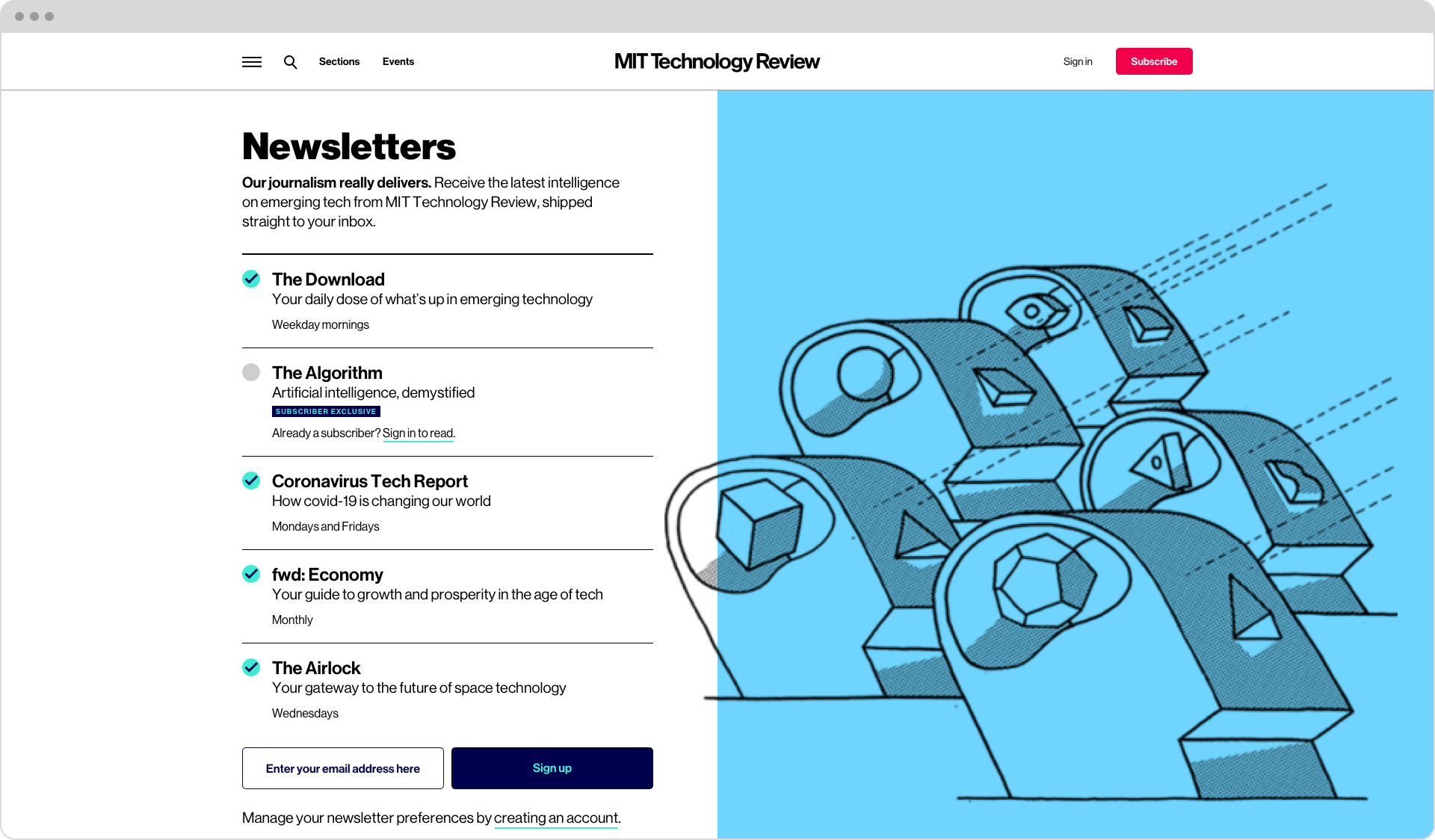
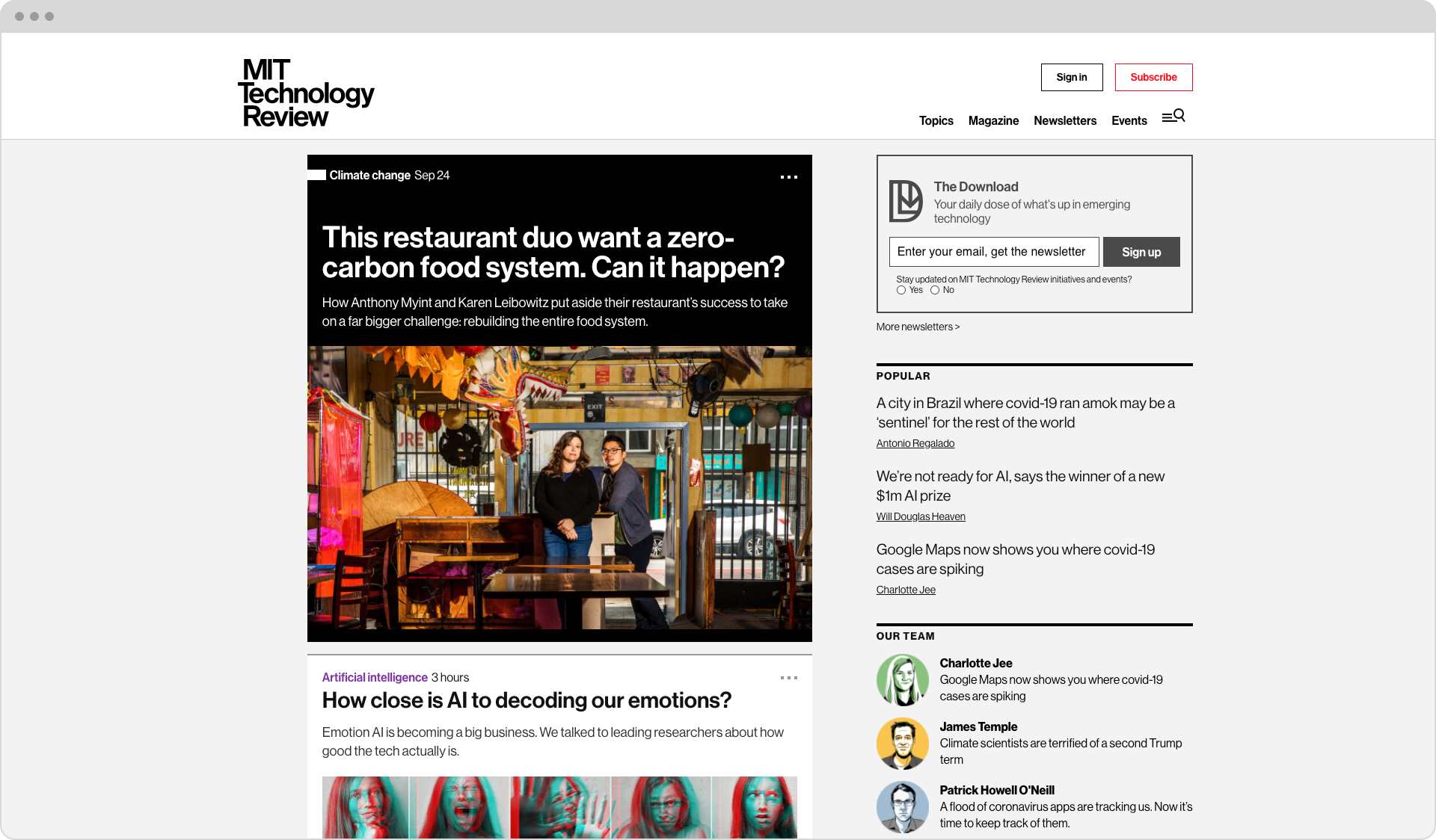
I started by refining and reducing the number of styles and component variations in our design system, applying accessibility standards and extending that system throughout the site. I established a responsive 12-column grid that met the demands of our highly-trafficked story pages as well as our redesign’s central concept — an infinite-scroll, social media-style feed of story teases in various formats, which lived on our homepage and at the bottom of every story.
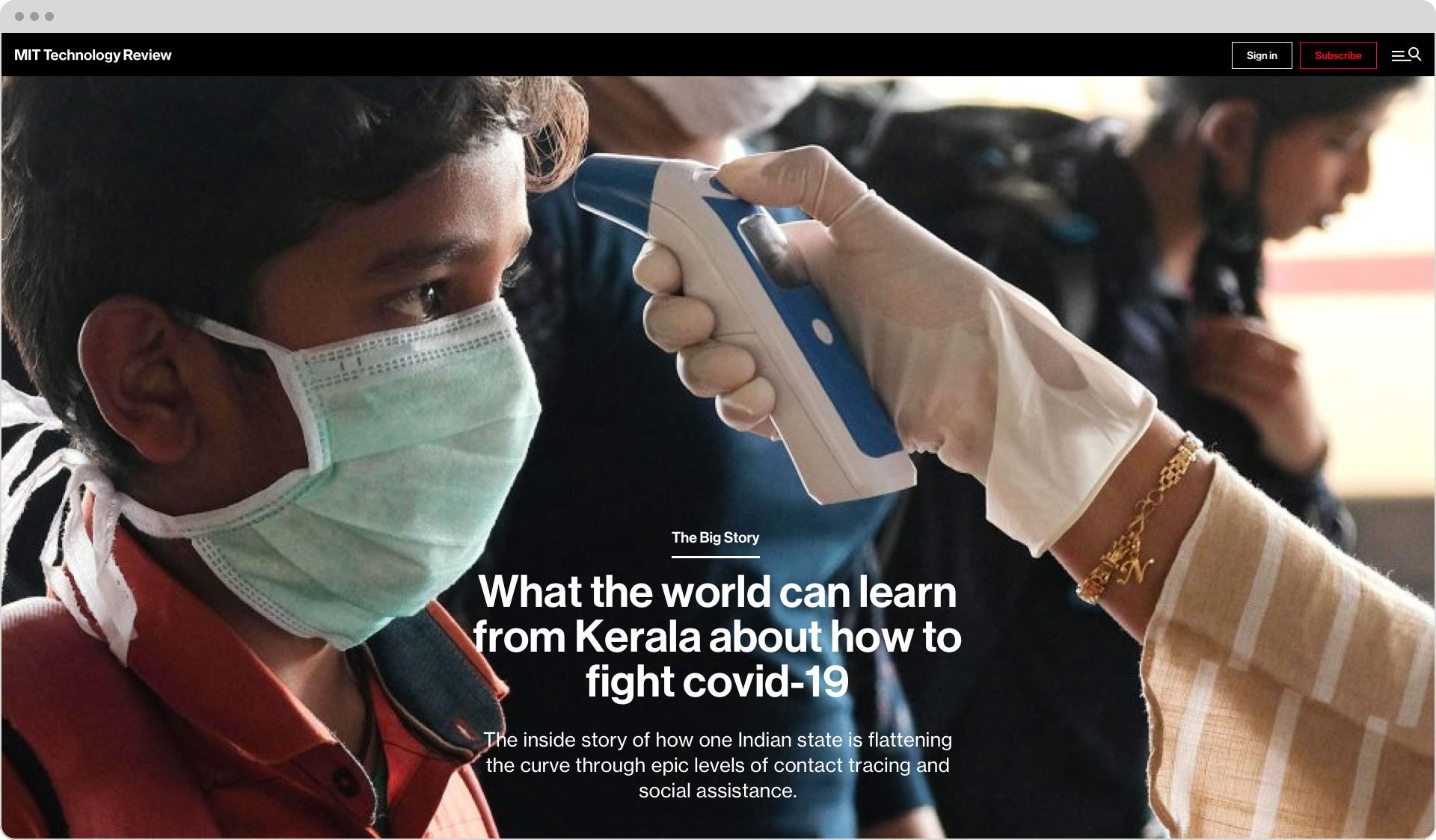

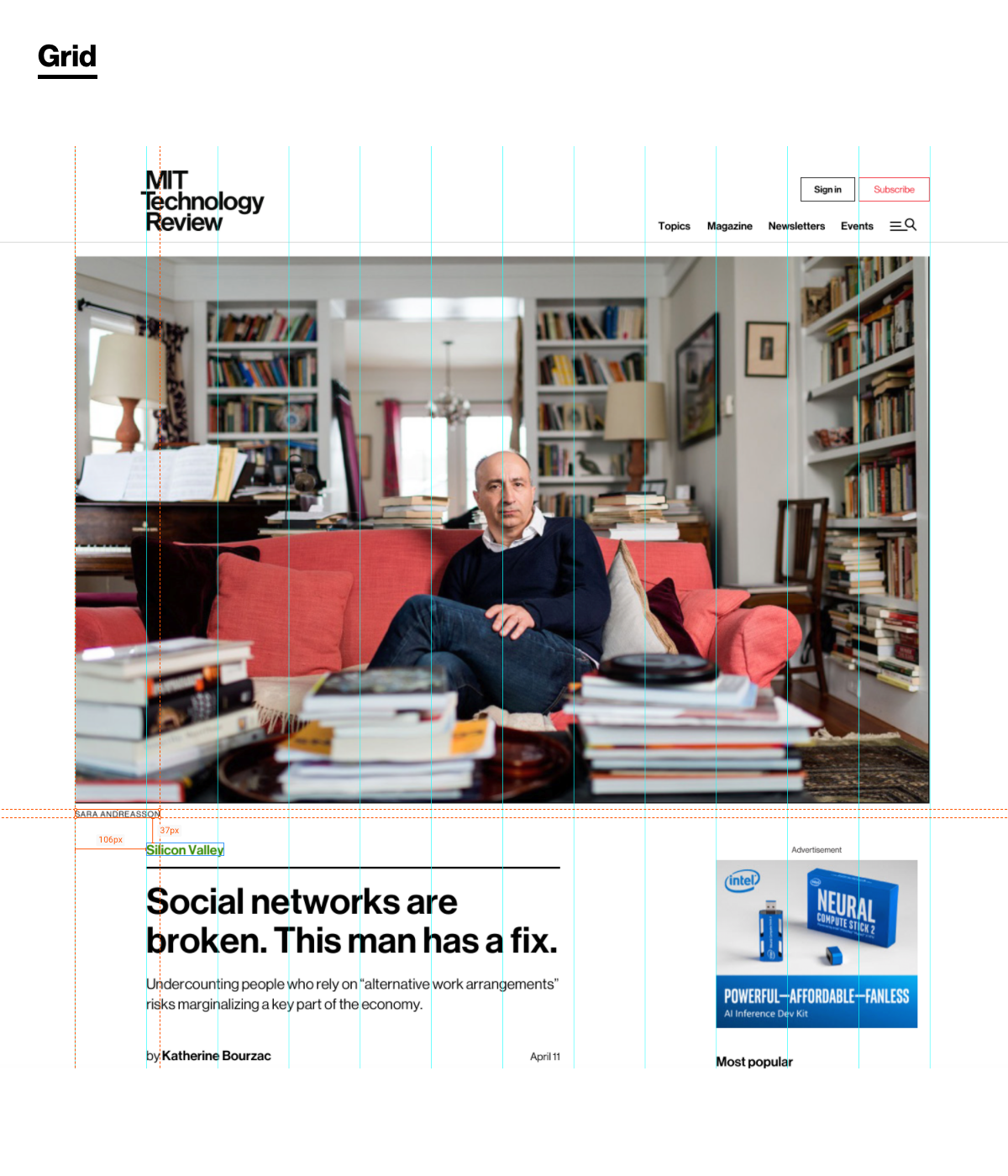
I conducted a sitewide content audit to simplify the site’s taxonomy and information architecture, and reorganized our primary and secondary navigation menus; I reduced the number of nav items by collapsing unnecessary heirarchies and combining and eliminating redundant pages. I developed a variable page model to simplify and standardize tertiary page layouts, and I proposed and launched a variant to the persistent header so it reflected user intent: sharing icons when scrolling down while reading, and the site menu when scrolling up, offering opportunities to remain engaged.
The redesign combined characteristics of traditional media sites with social media conventions to encourage deeper engagement among our readers; more frequent visits and longer stays on site. To deliver on that intention, we designed a chronologically-based stream of story teases to serve the site’s core concept, taking into consideration a number of revenue-related factors — ad placements, inhouse promotional units, sponsored content — and an increased pace of story publishing on the site that our company leadership anticipated. Importantly, we had to program something our custom CMS could support. Our solution was one that allowed for editorial curation and visual variety, while appearing random; every night, our feed layout logic re-randomized. We called it “the midnight shuffle.”